
Operations managers for large fleets require the proper tools to map their tracked assets, identify anomalies, and foster an efficient workforce. Listening to dozens of ops managers, and watching them analyze their team's location data, we developed a better understanding of our customers' objectives. They needed a tool to quickly assess the activity of their devices, dive deep on a device's history when needed, and view devices by groups corresponding to their org hierarchy.
In response to the feedback we received, we're super excited to announce improved views for ops manager dashboards. Here is our newest tool for you to select and analyze your tracked assets. As always, all of our views can be embedded into your existing dashboard, empowering your team with the tools they need to track assets with ease. Let's dive into the features.
Activity at a glance
The pie chart shows your devices intended to be tracked, broken down by their activity state during the day:
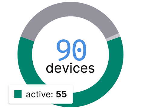
- Active devices are ones with any location recorded in the selected day.
- Inactive devices are ones that could not track all day due to a known reasons like a device's location permissions being denied, or app being force stopped.
- Disconnected devices are ones that might have cached location data, but have lost sync with the HyperTrack cloud.
These groups are displayed as binned lists that you can use to browse, filter and manage.
With the new activity bar and icons, you can see how a device spent its day and quickly act on operational outages:

The bar represents the total time elapsed in the current day, or 24 hours if previous day is selected. From left to right, the active colors are: dark green representing your device's time stopped, a medium green for walks, and a light green for drives. Then, light grey for inactive, and dark grey for disconnected.
If you are viewing the current day's data, you will see the current activity status and battery level. Additionally, if your device has trips you will see an icon to identify this.
Historical views

Grab a time machine and dig into your past data. With a new date and timezone picker available in all of our views, you can view your devices' location data for any day. For the current day, you will always see the latest live locations, activity states, and outage reasons for your devices.
Timeline views
When a device is selected, its location history will be shown as a path on the map, and a summary of their activity states will be shown on the right sidebar. Upon selection, their path will auto-play. You can find controls for playback at the bottom right.
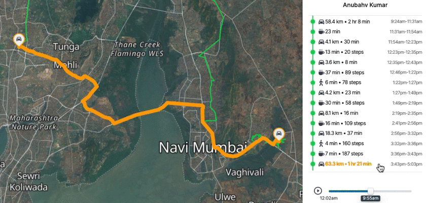
By selecting an activity marker on the summary, the path segment will be highlighted with the activity that device was in during that time span. This is incredibly helpful for identifying route deviations or inefficiencies.
Hierarchical views
The new hierarchical views allow managers to sift through the noise and find their assets efficiently. Clicking the tree icon in the upper left will toggle this new view. A selectable hierarchy of your device's metadata can be used to view a device group in both the map and the binned activity lists.
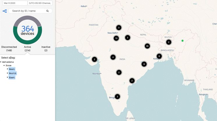
By segmenting your devices by groups, you can quickly filter your assets by type, status or whatever metadata you decide to assign.
What would you like to see?
Now go to your HyperTrack dashboard to check out these new views, or sign up for a free developer account.
We are keen to hear from product development teams building asset tracking experiences with live location data. Write to us or post requests on our public board.

